Web Design
Web design – Everything you want to know!
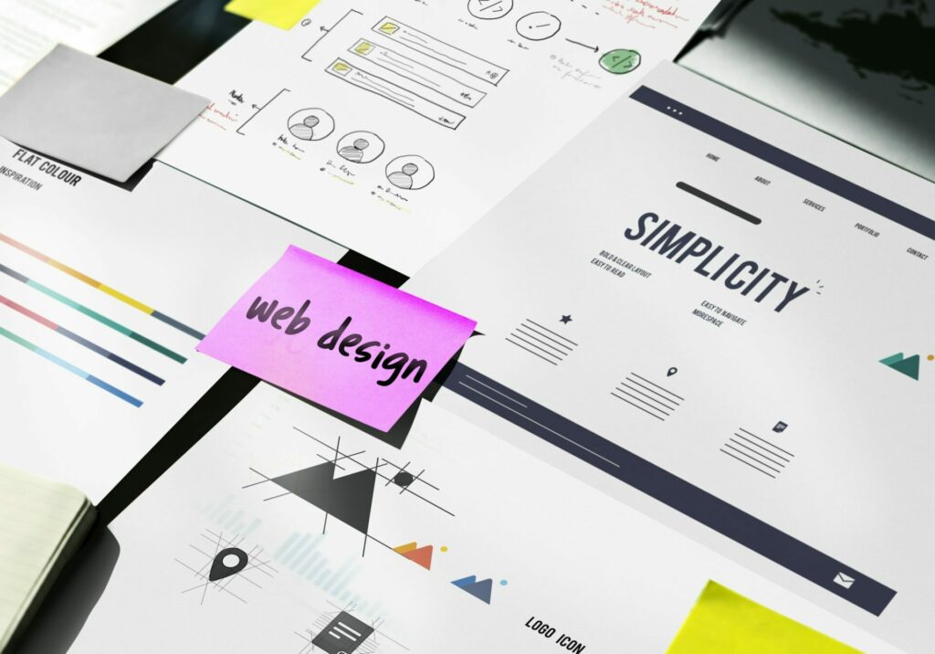
What is web design? When creating a website – especially a homepage – you often come across the same questions. What exactly is web design,
When creating a website – especially a homepage – you often come across the same questions.
What exactly is web design, what does web design involve and how do I become a web designer?
You can find the answers to these questions in this blog about web design!
Let’s take a look at the definition of web design:
“Web design as a discipline of media design comprises the visual, functional and structural design of websites for the internet.”
What does web design mean more precisely?
Web design is what defines the overall appearance, i.e. the atmosphere, the mood and the structure of a website.
From the creation of the website, the structure, the layout, the planning and right down to the images, colors and fonts (typography)
⇒ These are all elements of web design. What makes up the branding and usability of a website is also part of web design.
If you are interested in SEO consulting, please get in touch with us. We will advise you at your request. Our goal is for your website to be found on Google for your relevant keywords as soon as possible. We look forward to hearing from you!
Web design refers to the planning, design and creation of websites. As already mentioned above. It includes various aspects such as layout, user interface, graphics, fonts and content.
Web design is a creative and a technical discipline that aims to make websites aesthetically pleasing and functional user-friendly.
In short, you have …
“Without the web design, no beautiful, but also functioning website”

In today’s digital age, web design plays a crucial role. Websites are often the first point of contact between a company and its potential customers.
A well-designed website can improve the first impression, optimize the user experience and reinforce the brand identity.
It also contributes to search engine optimization (SEO) by improving the structure and accessibility of a website. Aspects such as loading speed, mobile optimization and clean code structure also play an important role.
Thoughtful web design goes beyond aesthetic aspects and also encompasses the functionality and usability of a website.
Here are some of the key reasons why web design is so crucial in today’s digital age:
First impression: A website is often the first point of contact between a company and its potential customers. A professional, appealing design can boost users’ confidence and encourage them to stay on the site longer.
User experience (UX): An intuitive and user-friendly web design ensures that visitors find their way around the site easily, which increases dwell time and reduces the likelihood of them leaving the site in frustration.
Brand identity: A consistent web design that incorporates colors, fonts and design elements that match the brand helps reinforce brand identity. This helps to build a strong, recognizable presence online.
SEO benefits: A well-structured web design improves the crawlability of the website for search engines, which means that search engines like Google can index the pages more easily.
Accessibility: An inclusive web design ensures that the website is accessible to all users, including people with disabilities. This is not only important from an ethical perspective, but can also meet legal requirements and increase the reach of the website.
Conversion optimization: A well thought-out web design can directly contribute to increasing the conversion rate by providing clear call-to-actions (CTAs) and guiding the user on their journey to the desired action, be it a purchase, making contact or subscribing to a newsletter.
The web design history began in the early 1990s with the introduction of the World Wide Web. Initially, websites were purely text-based and offered only limited design options. Over time, HTML (HyperText Markup Language) and CSS (Cascading Style Sheets) were developed, allowing designers to better control the layout and appearance of websites.
1. 1991-1995: Early phase of web design
2. 1996-1999: The beginnings of graphic design
3. 2000-2004: Flash era
4. 2005-2010: Web 2.0 and AJAX
5. 2010-2015: Rise of responsive design
6. 2015-today: Modern web design trends
A lot, a lot, a lot! Technological development has had a significant impact on web design.
With the introduction of new technologies and tools, designers have been able to create increasingly complex and engaging websites. Early websites were limited to simple HTML tags, while modern websites are based on technologies such as JavaScript, CSS3 and HTML5.
Content Management Systems (CMS) such as WordPress and Joomla have made it possible to create and manage websites without extensive programming knowledge.
The development of web standards by the World Wide Web Consortium (W3C) has also played a major role.
These standards have improved the compatibility and accessibility of websites.
This all leads to better, faster and more secure websites that are user-friendly and consistent.
Web design is more than just the aesthetic design of a website; it is an interdisciplinary process that combines technology, creativity and user-friendliness.
A well-thought-out web design can make the difference between a successful online presence and a digital failure. You should know the following basic principles.

Definition: Visual hierarchy is the principle by which the importance of elements on a website is determined in order to direct the user’s attention.
This is how visitors should be able to intuitively recognize the most important content.
Techniques:
Definition: Consistency in web design means that design elements and patterns are uniform across the entire website.
This allows you to create a coherent experience that makes navigation and use easier.
Techniques:
Definition: Balance refers to the distribution of the visual weights of elements, while alignment ensures that all elements appear orderly and connected.
This allows you to create a harmonious and aesthetically pleasing layout.
Techniques:
Definition: Contrast emphasizes differences between elements, while emphasis highlights certain elements.
This allows you to highlight important information and improve readability.
Techniques:
Definition:Unity and harmony refer to the interaction of all elements of a website to create a coherent overall picture.
This allows you to create a consistent and pleasant user experience.
Techniques:
Web design elements are the building blocks that are used in combination to create appealing and functional websites.

The layout is the arrangement of the content on a website, while the structure refers to the logical organization of the content.
You should arrange content so that it is easily accessible and understandable.
You can achieve this by using the following systems:
Color theory is the study of colors and their effect on the viewer.
Using colors specifically to evoke emotions and support user guidance.
Techniques:
Typography includes the selection and design of fonts.
Increase the readability and aesthetic appeal of texts.
Techniques:
Images and graphics are visual elements that are used to convey information and for aesthetic design.
Support content visually and arouse the interest of users.
Techniques:
Navigation refers to the means by which users are guided through a website.
Enable simple and intuitive user guidance.
Techniques:
If you are interested in SEO consulting, please get in touch with us. We will advise you at your request. Our goal is for your website to be found on Google for your relevant keywords as soon as possible. We look forward to hearing from you!
The web design process is a structured sequence of activities necessary to create a functional and aesthetically pleasing website.
This process includes several phases, from initial planning to final implementation and maintenance.
Each phase has its specific tasks and objectives that help ensure that the final product meets user expectations and is of high quality.
Planning and research are the first steps in the web design process and lay the foundation for the entire project.
This phase includes understanding the project goals, analyzing the target audience and studying the competition. Thorough planning helps to set clear goals, define requirements and develop an effective strategy.
And ensures that everyone involved is on the same page and the design is built on a solid foundation.
Wireframing and prototyping are important steps to plan the structure and functionality of the website before the actual design is created.
These tools allow designers to test and refine ideas before moving into development.
User interface (UI) design is the creative process by which the visual design of the website is developed.
This includes the selection of colors, fonts, images and other design elements that together create an appealing and consistent look and feel.
UI design aims to enhance the user experience by providing an aesthetically pleasing and intuitive interface.
It is important that the design is both functional and visually attractive in order to engage and guide users.
Development and programming are the technical steps in the web design process where the design is translated into a functional website.
This includes writing HTML, CSS and JavaScript as well as integrating backend technologies when necessary.
Developers work closely with designers to ensure that the final product meets the design specifications and fulfills all functional requirements.
A well-coded website is fast, secure and easy to maintain.
Testing and Debugging
Testing and debugging are critical to ensure the website functions properly and is free of errors.
This includes checking the website on different devices and browsers, testing functionality, and finding and fixing errors.
Testing helps identify and fix potential issues before the website goes live, ensuring users have a smooth and positive experience.
The launch and maintenance are the final steps in the web design process. The launch involves publishing the website and making it available to the public.
After the launch, maintenance is important to ensure that the website remains up-to-date and functional. This includes monitoring performance, updating content and software, and fixing any issues that may arise.
A well-maintained website remains relevant to users and continuously provides a high user experience.

Static websites consist of fixed HTML documents that are delivered to the user unchanged.
Each page is a separate file, and changes must be made manually to each document.
This type of web design is easy to create and ideal for smaller websites with few updates.
Responsive web design automatically adapts the layout and content of a website to different screen sizes and devices.
Whether visitors to your website are using a desktop computer, tablet or smartphone, they will always receive an optimal user experience. The layout automatically adapts to the respective screen size, which significantly improves navigation and readability.
Better SEO rankings are already a given!
Search engines like Google prefer responsive websites. This is because a website that works well on all devices provides a better user experience, resulting in longer visit times and lower bounce rates.
All of this contributes to better rankings in search results.
Adaptive web design creates multiple fixed layouts for different screen sizes. When the website is loaded, the appropriate layout is selected based on the device size.
It can be optimized for specific devices and screen sizes, allowing precise control over the design.
Tip: Use fixed breakpoints and server-side detection of device size.
By creating multiple fixed layouts, the design can be tailored to the needs and characteristics of specific devices and screen sizes. This enables particularly precise control over the appearance and user experience on different devices.
Adaptive web design solutions offer developers and designers a high degree of control over the layout. Because fixed breakpoints are used, each layout can be carefully designed and tested to ensure it is perfectly matched to the target devices.
Design the website for mobile devices first and then for larger screens: That’s mobile-first design!
It optimizes the user experience on mobile devices, which are increasingly being used to access the Internet.
It reduces load times and improves performance by prioritizing content and features for small screens.
As more and more people use the Internet on their mobile devices, mobile-first design ensures that the user experience on these devices is top-notch. Content and features are prioritized for small screens, making navigation and interaction easier.
By focusing on the essentials and optimizing for small screens, website load time is significantly reduced.
This results in a faster and more efficient user experience, which can improve both user satisfaction and search engine rankings.
With mobile-first design, the most important content and functions are developed first.
This ensures that the core messages and services are easily accessible on mobile devices and that the website fulfills its essential tasks even on small screens.
Adobe Photoshop is a tool for creating and editing graphics and layouts. It is ideal for detailed design work and image editing.
With a wide range of features and tools, Photoshop enables designers to create complex graphics, retouch photos and design layouts for websites.
Sketch is a vector-based design tool developed specifically for web and app design. It is known for its ease of use and strong plugin community.
Sketch allows designers to create precise and scalable designs that easily adapt to different screen sizes. The extensive selection of plugins means that Sketch’s range of functions can be adapted to the individual needs of designers.
If you are interested in SEO consulting, please get in touch with us. We will advise you at your request. Our goal is for your website to be found on Google for your relevant keywords as soon as possible. We look forward to hearing from you!
A cloud-based tool for design and prototyping that enables real-time collaboration. Ideal for teams working together on projects.
A tool from Adobe that was specially developed for the creation of prototypes and user interfaces. Offers integrated functions for interactions and animations.
A powerful, free code editor from Microsoft that supports a variety of programming languages and can be extended with plugins.
A powerful, free code editor from Microsoft that supports a variety of programming languages and can be extended with plugins.
WordPress is the world’s most popular CMS and is used to create and manage websites. It offers a wide range of plugins and themes that make it possible to customize the functionality and design of the website without any programming knowledge.
WordPress is particularly known for its ease of use, making it an ideal choice for both beginners and experienced web developers.
Joomla is another popular CMS that is known for its flexibility and extensibility. It is particularly suitable for more complex websites and applications as it offers a robust framework structure. With numerous extensions and templates, Joomla can be customized to meet specific needs and offers advanced features for managing large and complex content.
HTML is the basic markup language for structuring content on the web.
It defines the elements of a website, such as headings, paragraphs, links and images.
CSS is used to design the look and layout of HTML documents.
It allows content and design to be separated, making maintenance and customization easier.
JavaScript is a scripting language that enables interactive and dynamic elements on websites.
It is often used to process user interactions, create animations and load data.
.

UX design is crucial because it has a direct impact on user perception and behavior.
A positive user experience can increase the time spent on the website, improve the conversion rate and strengthen user loyalty!
Good UX design is based on several principles, including clarity, consistency, feedback and efficiency.
It is important to understand the needs and expectations of users and incorporate these into the design process.
User research involves collecting data about the target group to understand their behaviors and preferences.
Personas are fictional characters based on this data and are used to better represent and appeal to the target group.
Usability tests are carried out to evaluate the user-friendliness of a website. By observing and interviewing users, problems can be identified and fixed before the website goes live.
A well-designed user experience can increase user satisfaction, increase frequency of use and strengthen loyalty to a brand or product.
All in all, UX design plays a major role in ensuring that products and services meet the needs and expectations of users, which contributes to the long-term success of a website or application.
UI design is important because it defines the appearance and interactivity of a website.
A well-designed UI can significantly improve the user experience and make using the website more intuitive.
Effective UI design is based on principles such as simplicity, consistency, visibility and feedback.
It is important that the user interface is clear and easy to understand to enable seamless interaction.
Accessibility in UI design ensures that the website is accessible to all users, including people with disabilities.
This includes the use of high-contrast colors, alternative text for images and clear navigation.
Interactive elements such as buttons, forms and menus are essential components of UI design. They should be designed intuitively and provide immediate feedback on user actions.
Responsive design is important because more and more people are using the internet via mobile devices. A responsive website ensures that all users have a good experience regardless of their device.
The principles of responsive design include flexibility, adaptability and scalability. Websites should automatically adapt to the screen size and reorganize content accordingly.
The principles of responsive design include flexibility, adaptability and scalability. Websites should automatically adapt to the screen size and reorganize content accordingly.
– Flexibility
Website content, including layouts, images and text, should be designed flexibly to adapt to different screen sizes and resolutions. This is often achieved through the use of flexible grids and percentage widths rather than using fixed pixel values.
– Adaptability
Responsive design requires that the layout dynamically adapts to different devices. This includes not only different screen sizes, but also different orientations (portrait or landscape) and resolutions. Media queries are used to apply specific CSS rules for different devices and screen sizes.
– Scalability
Scalability is crucial to ensure that the website looks and works well on a variety of devices, from small smartphones to large desktop monitors. Elements such as images and typography must be scalable to remain legible and appealing regardless of device size.
If you are interested in SEO consulting, please get in touch with us. We will advise you at your request. Our goal is for your website to be found on Google for your relevant keywords as soon as possible. We look forward to hearing from you!
Responsive design techniques include media queries, flexible grid layouts and scalable images.
Use responsive web design like this:
– Flexible layouts
By using a flexible grid system, where widths are specified as a percentage, the layout can be adjusted proportionally to the screen size. This enables dynamic adaptation of the content, regardless of the device size.
– Media queries
Media queries are a central tool in responsive design. They make it possible to define different styles for different screen sizes and resolutions. This allows the layout to be adapted as required to ensure an optimal user experience.
– Fluid images and media
Images and other media should adapt flexibly to the size of their container. This can be achieved by using the CSS property max-width: 100%;, which prevents images from becoming larger than their container and allows them to shrink proportionally.
– Typography
The font size should be specified relatively (e.g. in em or rem) rather than in fixed pixels to ensure that the text is easily readable on all devices. In addition, media queries can be used to adjust the font size for different screen sizes.
Accessibility is important to ensure that no one is excluded from using a website due to disability. It promotes inclusion and enables all users to access information and services.
The WCAG are international guidelines that provide recommendations for improving accessibility on the web. They include principles such as perceptibility, usability, comprehensibility and robustness, which help to create accessible websites.
Accessible website design techniques include using semantic HTML, adding alternative text for images, ensuring sufficient contrast and providing keyboard navigation.
These techniques help to make the website accessible to people with visual impairments, motor impairments and other disabilities.
By applying these approaches and techniques to web design, you can ensure that your website is not only aesthetically pleasing and functional, but also inclusive and accessible to all users.
SEO (Search Engine Optimization) is crucial to increasing a website’s visibility in search engines.
Good web design must incorporate SEO practices to ensure that the website is easily found and ranks highly in search results.
The combination of aesthetic design and effective SEO can significantly improve traffic and conversion rates.
On-page SEO includes all measures that are carried out directly on the website to improve the ranking.
This includes the optimization of meta tags, the use of keywords in headings and texts, the creation of high-quality and relevant content and the optimization of images with alt texts.
Internal linking and the structure of the URL are also important aspects.
Technical SEO refers to the technical requirements that must be met in order for a website to be crawled and indexed efficiently by search engines.
These include:

Current trends in web design include minimalist designs, the use of large and eye-catching typography, dark mode designs, 3D elements and animations.
Microinteractions and personalized user experiences are also gaining importance.
The goal of these trends is to improve the user experience and capture users’ attention.
New technologies such as artificial intelligence (AI), machine learning, progressive web apps (PWA) and AMP (Accelerated Mobile Pages) are having a significant impact on web design.
AI can be used to personalize the user experience and create design suggestions.
PWA and AMP improve website load times and performance, especially on mobile devices.
What about the future?
The future of web design is likely to be characterized by even greater personalization, the increased use of AI and machine learning, the integration of augmented reality (AR) and virtual reality (VR) and the development of new user interaction methods!
They aren’t just helping.
These technologies will completely change the way we interact with websites and create entirely new user experiences.
Effective layout and design practices include using a clear and consistent design, prioritizing content, using whitespace to improve readability, and ensuring intuitive navigation.
A well-structured layout guides users through the site and makes it easy for them to find the information they need.
Mobile optimization is essential as more and more people use the internet via mobile devices. A responsive design ensures that the website looks and works well on all devices.
This includes flexible layouts, customizable images and user-friendly navigation.
Fast loading times are crucial for user experience and SEO ranking.
Measures to improve loading times include optimizing images, minimizing CSS and JavaScript files, using Content Delivery Networks (CDNs) and implementing caching strategies.
Security is an essential aspect of web design. The use of HTTPS, regular software updates, the implementation of security plugins and firewalls and the performance of regular security checks all help to protect the website from threats.
A poor navigation structure can lead to users leaving the website because they cannot find the information they are looking for. Clear and logical navigation is therefore essential.
Use clear menus, breadcrumbs and a search function to improve user guidance.
Too much content can overwhelm users and impair readability. Focus on the most important information and use whitespace to break up the content.
A well-structured page with clear headings and paragraphs makes it easier for users to find the relevant information.
Neglecting mobile users can lead to a poor user experience and negatively impact SEO rankings.
Make sure the website is optimized for mobile devices and that all features and content are accessible and user-friendly on smaller screens.
User feedback is valuable for identifying the strengths and weaknesses of a website. Don’t ignore it, but use it to make continuous improvements.
Implement feedback forms and conduct regular surveys to gather users’ opinions.
If you are interested in SEO consulting, please get in touch with us. We will advise you at your request. Our goal is for your website to be found on Google for your relevant keywords as soon as possible. We look forward to hearing from you!
Successful web design projects are characterized by a clear target group approach, an appealing design, intuitive user guidance and good performance.
Analyze these projects to find out which strategies and techniques have led to success. Examples can be websites of major brands or award-winning designs.
Valuable lessons can be learned from design failures. Analyze projects that were not successful to identify and avoid common mistakes.
This can help make future projects more efficient and successful 🙂
How do I become a web designer? But first: what do you need to become a web designer!
A career in web design requires creative skills, technical knowledge and an understanding of user behavior. Knowledge of HTML, CSS, JavaScript and design software is just as important as problem-solving and project management skills.
There are several specialized roles in web design, including UX designers who focus on user experience, UI designers who handle visual design, and front-end developers who translate design into working code.
Each role requires specific skills and knowledge.
There are several educational pathways to pursue a career in web design, including formal degrees in design or computer science, bootcamps and online courses.
Resources such as books, tutorials and educational institutions provide additional learning opportunities and support.
AI and machine learning will change the way websites are designed and personalized.
These technologies can automate design decisions, analyze user behavior and provide tailored user experiences.
AR (augmented reality) and VR (virtual reality) are increasingly being integrated into web design to create immersive and interactive experiences.
These technologies offer new opportunities for e-commerce, education and entertainment.
The future of user interaction will be characterized by voice-controlled interfaces, gesture control and other innovative methods.
These new technologies will change the way users interact with websites and open up new opportunities for creative web design.
By taking these aspects and trends into account in web design, you can create future-oriented and user-friendly websites that meet the needs of modern Internet users.
I hope this post has answered your questions about web design! 🙂
What is web design? When creating a website – especially a homepage – you often come across the same questions. What exactly is web design,

In today’s digital world, a strong online presence is essential, and a website is often the centerpiece of that presence. For WordPress users, this means

In today’s digital world, OnPage Optimization is an indispensable tool for improving the visibility of your website in search engines. While many rely on off-page
webhead is a professional and experienced IT company based in Vienna—the IT company for all your digital needs. We are your competent partner for IT services such as WordPress, digitization, web design, website development & search engine optimization. Together we create and perfect your online presence.
All information subject to errors, typing errors and changes
Wir rufen Sie spätestens am nächsten Werktag zurück!
You need to load content from reCAPTCHA to submit the form. Please note that doing so will share data with third-party providers.
More InformationMit “Senden” habe ich die Datenschutzrichtlinien und die AGB webheads gelesen und stimme diesen ausdrücklich zu.
We will call you back no later than the next working day!
You need to load content from reCAPTCHA to submit the form. Please note that doing so will share data with third-party providers.
More InformationWith “Send” I have the Privacy Policy and the GTC webheads and I expressly agree to them.